ELVIA
How we redesigned and modernised Elvia's power outage map to a mobile-friendly, accessible service used by 900,000+ potential users in Viken county.
%201.png)

Project information
My role
Senior UX Designer
Team
1 Product Owner
2 front-end developers
2 back-end developer
1 customer support expert
Product
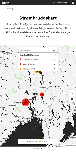
A new mobile friendly power outage map
The assignment
When Hafslund and Eidsiva merged to form Elvia, Norway's largest electricity grid operator, it was time to build something new. The existing power outage map was technically complex, hard to understand, and not adapted for mobile. That was a problem, because mobile was exactly what people used when the power went out. The goal was to modernise the map so that key information about outages was immediately clear, mobile-friendly, and accessible to everyone.
Project overview
My role
Senior UX Designer, sharing design responsibility with one other designer. We planned the process together and divided tasks between us, which allowed us to move quickly through the research phase. While one of us conducted user interviews, the other facilitated workshops — running both tracks in parallel without losing quality or momentum.
Process
We started by mapping what users actually needed when they opened the map. Interviews with customer service revealed that the same questions came up every time: am I affected, how many others are impacted, and when will the power be back? A survey on elvia.no confirmed the same pattern.
The old solution required four steps just to look up your own address. Most users arrived in the middle of an active outage, stressed and on mobile. Four steps was four too many.
We ran Crazy 8 workshops with the customer service team to generate ideas, followed by usability testing of wireframes with users in the office canteen. A deliberate decision was made not to show estimated restoration time. It was technically very difficult to estimate accurately, and a wrong estimate would have generated more calls to customer service, not fewer. Instead we designed clear status indicators that showed exactly where in the process the repair team was, so users understood that someone was actively working on the problem.
The solution was built mobile-first and designed to WCAG 2.1 AA accessibility standards throughout.